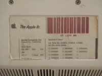
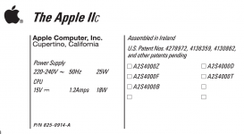
• Updated 2023-07-12: Hello, Guest! Welcome back, and be sure to check out this follow-up post about our outage a week or so ago.

Apple IIc label

BadGoldEagle

Well-known member
Hi

My new IIc is in perfect condition but the bottom sticker is missing.

Here’s what I’m on about:
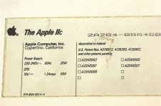
878A96A0-9321-4F89-92F0-F7644456B248.jpeg

This picture is a great template to work on. I’ll use it to recreate a label on Photoshop.

Problem is, I have no idea what my IIc’s serial number could be. 2A2S4 seems to be common to all IIcs but the rest is specific to each machine. What I do have on the other hand is the logic board’s serial number. Could it be the same as the unit’s serial number? I don’t have another IIc to check unfortunately.

thanks!


BadGoldEagle

Well-known member
I’m gonna use the LB’s serial number. It’s probably not the right one but at least that’s better than nothing.

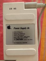
@olePigeon, you have extensive knowledge when it comes to reproducing labels. I’ve got a question for you. Would you happen to know what type of font Apple used for the “Power Supply” text? I’m using Helvetica condensed and compressed and even though I’m adjusting the kerning a little, some characters simply aren’t the same... the “2” for example has a short “nose” (the roundy bit on the left) on the label and I can’t seem to find the correct font... I could hack it by inserting a rectangle or something but that doesn’t seem right. Any idea?

thanks!


joethezombie

Well-known member
I just happen to have my //c out on the bench to fix the crunchy keyboard!

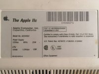
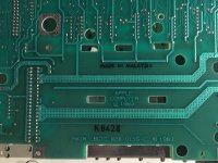
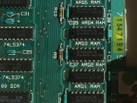
The label on the bottom doesn't match anything on the logic board.  Mine is an early model, with ROM 255.  I took some pictures for you.

Hope it helps!

iic-bottom.jpg

iic-lbb.jpg

iic-lbt.jpg


BadGoldEagle

Well-known member
Thanks for the nice pics joe!

My IIc is a european one so there's bound to be differences anyway... But since yours is a ROM 255 as well, it's definitely worth taking a look at this.

What particularly struck me is the kerning between the version I've found online and yours. For example, the "T" and the "h" are really close together on the irish one and on yours you can actually see a small gap between the two letters. It could either mean two things. One, that the printer used to make the irish label is of shoddy quality or two, that the font used wasn't exactly the same.

I'd personally say it's a mix of the two. But the font I've found for the Power supply text matches yours better than mine.


gilles

Well-known member
to me the most obvious difference in text is the small C of Apple IIc (smaller capital bold for Irish label and lowercase bold for US). Space between the 2 I is also different.

It seems more a "Sans serif" early font than an arial (or maybe an original postscript helvetica)

 
Last edited by a moderator:

Danamania

Official 68k Muse
The 'Power Supply' typeface looks like another of Apple's uses of Univers, also used on loads of Keyboards until relatively recently. 

My guess is the bleedy quality could just be due to the difference between a fresh inking of the stamps that imprint the label, and a later point in a run where some of the ink is used up.

They're different stamps with slight differences in the design, but the squishy edges may just be that variance through the production run.


olePigeon

Well-known member
@olePigeon, you have extensive knowledge when it comes to reproducing labels. I’ve got a question for you. Would you happen to know what type of font Apple used for the “Power Supply” text? I’m using Helvetica condensed and compressed and even though I’m adjusting the kerning a little, some characters simply aren’t the same... the “2” for example has a short “nose” (the roundy bit on the left) on the label and I can’t seem to find the correct font... I could hack it by inserting a rectangle or something but that doesn’t seem right. Any idea?
I haven't made anything Apple //c, but all the logo type was Univers.  It looks like they likely used it for the label as well, but they didn't use the Italic.  They typed it out normally, then scewed it at an angle.

 
Last edited by a moderator:

mac512

Active member
I guess I need to improve my reading skills... You were asking about the serial numbers... I'm afraid that case and motherboard numbers don't match. Box and case do match, as olePigeon already said.


olePigeon

Well-known member
@BadGoldEagle I went ahead and made a duplicate label for you based on the picture you sent.  It isn't to scale, but you can fix that since it's vector.  The font was definitely Univers with a smattering of Helvetica (for the "Apple Computer, Inc."), but they didn't use the Oblique font, adjust kerning, or anything.  They just typed it out, squished it with the freeform tool, and sheered it about 20 degrees.

There was no consistency to the text of the label.  [SIZE=1.4rem]Someone who had no idea what they were doing made the label on a program they'd never used.  Probably an engineer. :D   "Who cares how it looks, as long as it works."[/SIZE]

View attachment label.zip

preview.png


olePigeon

Well-known member
I just realized people uploaded a bunch more stickers.  Looks like they had different kinds for different years.  Maybe you can pinpoint roughly what year the computer was made.

Out of curiosity, is there any FCC info on the computer?


dcr

Well-known member
There was no consistency to the text of the label.  [SIZE=1.4rem]Someone who had no idea what they were doing made the label on a program they'd never used.  Probably an engineer. :D   "Who cares how it looks, as long as it works."[/SIZE]


Don't be too sure.  I've seen plenty of inconsistent work by people that presumably ought to know what they're doing.

I wonder if the italics were faux italics created by choosing italics for a font that didn't have italics available.  Older versions of PageMaker, for example, would automatically skew a typeface in such a situation.  I remember one time I had to take a copy of a font in Fontographer and skew it so that it would match the "italics" of the font to which the customer had grown accustomed.

On an unrelated note, I also remember a customer that was shocked we didn't have the particular font they liked, because it was a popular font and "everyone uses it."  Yet, in thirty-some years, we've only had a single request for that font.


olePigeon

Well-known member
I've been hoarding fonts lately.  You can often find them for really cheap on eBay.  My biggest conquest was the original Open Type edition of the complete Adobe Font Folio for $160.  A friend of my parents works for Adobe and he got me an old copy for cheap.  I guess they were liquidating it because they now have over 2000+ fonts in the latest edition.  It's not like fonts go bad.  :p  I also bought the Adobe Pro Font collection, but that wasn't as impressive.  Only has like 10 fonts, but they are ridiculously extensive.  I guess that's why they're "pro" fonts.  Not to mention the various Apple font collection releases and Microsoft TrueType collections I bought cheap at a surplus store.  I also have a large collection of BitStream fonts that came on something like 12 floppies.  I need to dig them out and image them, plus a few odd Adobe fonts on floppy disk that are duplicates on my CD.  The disks look cool, though, so I might recreate the labels and file my fonts away on floppy for the heck of it.  It certainly would look cool if anything else.

I don't wanna be without fonts. :D

 
Last edited by a moderator:

olePigeon

Well-known member
Hah.  I just realized that they now sell the original Open Type collection I have for $140 as an "Education essentials" set.  I guess I got ripped off $20.  Oh well. :p


Trash80toHP_Mini

NIGHT STALKER
I guess they were liquidating it because they now have over 2000+ fonts in the latest edition.  It's not like fonts go bad.  :p  I also bought the Adobe Pro Font collection, but that wasn't as impressive.  Only has like 10 fonts, but they are ridiculously extensive.  I guess that's why they're "pro" fonts.
Back in the deepest darkest days at the birth of desktop typesetting. Typeface somehow became equated with the word Font which is a collection of faces and Family was completely lost in the tide of the unwashed masses of wannabe desktop designers. Never mind the text/display differential. Anybody remember the days of eight different "Fonts" used on a single page? I still cringe when I see something set in OLD ENGLISH CAPS. ::)

Does your pro collection come with complete Families of Type or swashes and ligatures for the faces?


olePigeon

Well-known member
As far as I can tell, it's everything.  According to Adobe "Supported OpenType features include Stylistic alternates, ligatures, proportional numbers, old style figures, small caps, subscripts and superscripts, ordinals, and swashes."

 
Top