• Updated 2023-07-12: Hello, Guest! Welcome back, and be sure to check out this follow-up post about our outage a week or so ago.

Early System Software versions

Dog Cow

Well-known member
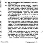
On the topic of missed chances to preserve something interesting and increasingly difficult to find again, here's a photo I pulled from eBay long ago:

 I'm not sure how these were distributed, if they came with 800K external drives, or were just sent to dealers who gave them (or copies of them) to customers with 512Ks when they bought an 800K external drive.
I agree, probably that was a dealer's disk that was used with the Apple External 800K Drive.

 
Last edited by a moderator:

slomacuser

Well-known member
I think I was aware of the existence of the Macintosh 512K Guided Tour disk (System 1.1, Finder 1.1h) that you list, but I must not have had access to it and so wasn't completely sure it wasn't a myth. So it's not shown on my site. Where did you get that date? Do you know what the disk itself looked like? If there is a different set of disks (or just a different Guided Tour disk) in the box for later 512Ks, obviously that would be something I'd be very interested in.

One area that I have never seen explored is Finders 2.6 and 3.4, which were distributed for testing among developers and dealers during the long 11-month run of System 1.1. There's a fairly complete description of Finder 2.6 in MacTech (see my site for link). It would be fun to find those.
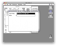
I have opened all files with resedit to check dates, I was doing this 2 years ago so I do not remember exactly everything but I have found a screenshot.

Picture 4.png


Dog Cow

Well-known member
I have opened all files with resedit to check dates, I was doing this 2 years ago so I do not remember exactly everything but I have found a screenshot.
It's faster to use HexEdit in Mac OS X to examine the entire disk image for the version string or date. Do an ASCII search. HexEdit can also switch between data/resource fork.

 
Last edited by a moderator:

tanaquil

Well-known member
On a similar subject...when did Taliesin become Mobile font-wise and when was Toronto officially dropped?
On Taliesin/Mobile, see @Dog Cow's links in the first page of this thread. The forum posts cited as evidence are from Jan 87; those forum posts in turn refer to the 800K drive upgrade and/or the release of MacDraw, which I think would put the change somewhere in 1986 (or possibly late 1985), but I'd have to go through my system disks one by one to find out exactly when the change became standard. According to the supposed Apple insider, it was a case of objection to copyright infringement, so the move could have come quite soon after its introduction in April 1985.

As for when Toronto was dropped, I'm not sure. I know it was shifted to the extra "Fonts" file as early as May 1984, but what its fate was after that, I haven't investigated. 


Scott Baret

Well-known member
Those were some interesting reads!! The old posts from 1997 were pretty cool to sift through as well. This also explains where the 36-point New York on the Print Shop disks came from. I'm guessing the rumors about a 36 point Athens are false?

What shocks me most is that Talisen was such a late addition to everything--which also probably explains why people didn't know much about it. Now I have to dig out a shareware game called Mac Concentration, which had both fonts and I believe had a copyright date of 1985...would like to see what they called it there...

The Mobile name is used on the System 6 disks. No Toronto is included in any System 6 (but continued to be part of Print Shop's font file for years). 

I'm also curious now as to why the 36-point New York was dropped after a while (also was on Print Shop's font disk...I think that version of Print Shop stayed in production until 1993 or 1994).


tanaquil

Well-known member
I have a bit more news on Taliesin and Toronto.

@Rasmus shared some disk images with me (thank you!!). From examining them, I found:

- My guesses re: the font lineup for System 1.0 and System 1.1 were exactly correct (I am ridiculously proud of this - I spent way too much time researching that information)

- Taliesin 18 was indeed introduced on the System Update disk in April 1985, and still appears on the main System 2.0 disk that came out in June 1985

- A major shakeup happened with the Jan 1986 introduction of System 3.0 and continued throughout 1986 in all the System 3.2 releases. 

Jan 86 is the first evidence of Mobile 18 replacing Taliesin 18 in the Fonts file (it may have happened earlier but I don't have any proof of it). Toronto disappears from the lineup. Several new fonts appear - Courier, Helvetica, Times and Symbol. Old friends like Athens, Cairo, San Francisco and Venice are still hanging around in the Fonts file.

Font/DA Mover now lives inside the System Folder; extra Fonts file inside Utilities folder.

The new lineup is: 

System File

Chicago 12
Courier 10
Courier 12
Geneva 9
Geneva 10
Geneva 12
Geneva 14
Geneva 18
Geneva 20
Geneva 24
Helvetica 10
Helvetica 12
Monaco 9
Monaco 12
New York 9
New York 10
New York 12
New York 14
New York 18
New York 20
New York 24
Times 10
Times 12
Venice 14

Fonts file

Athens 18
Cairo 18
Courier 9
Courier 14
Courier 18
Courier 24
Helvetica 9
Helvetica 14
Helvetica 18
Helvetica 24
London 18
Los Angeles 12
Los Angeles 24
Mobile 18 
San Francisco 18
Symbol 9
Symbol 12
Symbol 18
Symbol 24
Times 9
Times 14
Times 18
Times 24
 

This might be a really strange way to spend the Memorial Day weekend, but hey, I hung out with friends last night and it's raining today.

I haven't gotten past System 3.2 yet. More later?


tanaquil

Well-known member
Those were some interesting reads!! The old posts from 1997 were pretty cool to sift through as well. This also explains where the 36-point New York on the Print Shop disks came from. I'm guessing the rumors about a 36 point Athens are false?

....

I'm also curious now as to why the 36-point New York was dropped after a while (also was on Print Shop's font disk...I think that version of Print Shop stayed in production until 1993 or 1994).
I certainly have never seen a 36 point Athens. You could generate it by blowing up 18 point to double size, but that probably looked pretty bad.

Why 36 point NY was dropped: good question. My guess is that for the purposes of the average Mac user, it quickly became obvious that 36 was just a curiosity. Font size 36 fonts of all kinds disappear in later versions. This may have been partly because not many people were using 18 point font on a regular basis. At the time, for HQ printing (on an ImageWriter! ha!), you needed both the original font and one double the size. 18 itself could still be useful as the double of 9 (and likewise 24 as the double of 12), but how many people needed 36 as the double of 18?

Except, of course, people making posters and banners and that kind of thing, i.e. (I'm guessing) Print Shop users.


Scott Baret

Well-known member
Thank you for all the research, folks!! System 3.0 really was a shakeup...new fonts, disappearance of fonts, HFS coming out...yeah, that last one just *may* be a big deal with that update...

Regarding NY 36, I liked it as a newsletter font, especially as the only true 36 point font in the lineup.

Speaking of enlarging Athens...Print Shop actually did exactly that in banner mode. Athens was the default font for banners. Not only did it get enlarged, it could be split into patterns. Each character could be made of multiple bricks, designs, smiley faces, you name it! Given its blockiness, Athens was a decent choice for this purpose.

Print Shop for Mac honestly didn't get a lot of coverage in the press (schools loved it though). I don't even remember any Mac books having sections on Print Shop (there was a review in MacWorld circa 1987 that I dug up once if that counts). It's a pretty fun little program, one of the first I had on the Mac after having been a veteran of the Apple II version. The graphics are top-notch, too.

Why include a font file? Simple--they used a lot of those fonts in the ready mades. I'm surprised Brøderbund included Seattle in their file, as it was Microsoft's font!

 

Dog Cow

Well-known member
 According to the supposed Apple insider, it was a case of objection to copyright infringement, so the move could have come quite soon after its introduction in April 1985.
What? Are you referring to scott douglass? He wasn't a "supposed Apple insider," he was an Apple employee who worked on the system software. Surely you've seen his name in credits for Chooser or some control panels. And his post from 1987 does not say copyright infringement.

Let's print his entire Usenet post here so all may read it and understand.

Code:
In article <966@uwmacc.UUCP> dubois@uwmacc.UUCP (Paul DuBois) writes: 
>So, what is the "real" name of this font?  Why the two name? 
As I understand it Taliesin is the name of Frank Llyod Wright's estate in 
New England.  The font in question has many symbols that are conceivably useful 
for architectural layout drawings.  I believe that the font first shipped with 
MacDraw.  The story goes that Mr. Wright's estate 
was not pleased at the use of the name and asked Apple to change it.  Why 
Mobile was chosen as the new name I don't know. 
None of the above is necessarily correct.  None of the above is the 
official position of Apple Computer. 
--  
                                --scott douglass, Apple Computer 
CSNet:  scott@Apple.CSNet        UUCP:  {nsc, voder, well, dual}!apple!scott 
                        "Laugh while you can, monkey boy!"
 

tanaquil

Well-known member
Ah, thanks for reprinting the whole text of the post; I misspoke. I was vaguely remembering the disclaimer at the end, which of course I see now is the usual boilerplate.


Scott Baret

Well-known member
My guess as to why Mobile was chosen is because some of the characters have map/transportation elements to them, as though it was a way to hide the architectural roots of the font.

Did Susan Kare design this one as well? I can't seem to get a handle on that.


Dog Cow

Well-known member
Mobile is also a city in Alabama, keeping with the theme.
True, but perhaps not a World Class city. Now Monaco was obviously named because it's a monospaced typeface. But Mobile?

Maybe there is a connection to its previous name Taliesin, or how it had to be renamed... Like Sosumi.

 
Last edited by a moderator:

tanaquil

Well-known member
Taliesin isn't a city either, so I'm guessing that they moved away from sticking to "World Class Cities" in 1985 and later. Certainly Courier, Times & Helvetica (1986) aren't cities. But I am as baffled as anyone else by the Mobile name. (I like the suggestions! They are fun. Maybe the images are like a child's mobile?)

I'll have to check the font file to see if I can find anything to say who designed it. I feel like Susan Kare was mainly involved with the 1984 fonts and less so later on, but I don't know that for sure. There must be more information about this in the early histories of the Mac - some were cited earlier in this thread.


tanaquil

Well-known member
True, but perhaps not a World Class city. Now Monaco was obviously named because it's a monospaced typeface. But Mobile?

Maybe there is a connection to its previous name Taliesin, or how it had to be renamed... Like Sosumi.


What's the story behind Sosumi? (That makes me nostalgic... I used to play with the sound files on my System 6 Classic all the time. Beep! Clank!)

 
Top