• Updated 2023-07-12: Hello, Guest! Welcome back, and be sure to check out this follow-up post about our outage a week or so ago.

Font & Size of the letters G3 on the Blue & White case

MacUp72

Well-known member
those?..hard to tell without stripping the machine..obviously a very fat serifless linear antiqua.

Bildschirmfoto 2023-06-14 um 10.29.42.jpg Bildschirmfoto 2023-06-14 um 10.29.55.jpg
 
Last edited:

ArmorAlley

Well-known member
Exactly.
Which is what I did and forgot to measure them.
I'd rather not strip my machine again, if I can help it.
I'm really hoping that this question has been answered before.

By serifless, do you mean sans-serif or a serif'd type with its serifs manually removed in Illustrator?
I'll have a look at the Antiqua type families.
 

sfiera

Well-known member
It looks a lot like Helvetica Black to me, though maybe slightly more rounded on the G.
 

Phipli

Well-known member
That is a very good idea.
I tried it just now with the picture MacUp72 supplied above but it is too vague.
I'll go hunting for better pictures after work tonight.
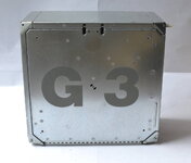
The issue is going to be that you only have two characters - it will struggle to narrow it down.
 

mg.man

Well-known member
I can't help with the type and size, but as it happened I'm replacing a cracked side panel today, so snapped you these :
20230615_125642.jpg
20230615_125211.jpg
20230615_125218.jpg
🙂
 

Chuckdubuque

Active member
Your best bet is to find a close enough font, take it into a program like Adobe illustrator, put the scan above into a translucent locked layer, on the main layer type G3, adjust size and letter spacing to match the scan as much as possible, then convert to outlines. You can then tweak the outlines to match the treatment on the case as closely as possible. Delete the scan layer, export as something like SVG, and use that.

It is highly unlikely that this is an unmodified off the shelf font so the likelihood of finding an exact font match is not high. But most of these logo treatments are based on a font and then customized for the particular application and size. I imagine Jobs and Ives arguing two weeks about the shape of the G.
 

sfiera

Well-known member
The 3 looks like a near-perfect match to Helvetica Black, but the G doesn’t quite line up. There are a few adjustments, condensing it slightly and straightening the lower stem of the G.
g3-g.pngg3-3.png
 

ArmorAlley

Well-known member
I imagine Jobs and Ives arguing two weeks about the shape of the G.
:) I can well imagine that happening. And, in those two weeks, nothing was more important to either of them.

Well done everyone and especially @mg.man! This is super.
Woudl you do me the favour of measuring the height of the letters please?

As it happens, the 3 will turned into a 4 and the other side will have a QS.
I have a Blue & Silver G3 and I have the parts for a Black & White G4 with a Quicksilver motherboard that has just come my way.
 

MacUp72

Well-known member
Helvetica Black is a good match, a bit of twisting and bending and its good..
I noticed that with the earlier PowerBook font, it's basis is a Adobe Garamond Pro bold but it certainly was altered.

Bildschirmfoto 2023-06-15 um 21.28.48.jpg
 

Phipli

Well-known member
Helvetica Black is a good match, a bit of twisting and bending and its good..
I noticed that with the earlier PowerBook font, it's basis is a Adobe Garamond Pro bold but it certainly was altered.

View attachment 58005
Apple's corporate font was a variation of Garamond called Apple Garamond for many years. Most of their adverts and case test and manual covers and other stuff were Apple Garamond through the 80s and 90s at least.
 

Crutch

Well-known member
Apple Garamond is a variant of ITC Garamond, condensed and with a taller x-height (clearly visible in @MacUp72’s image above), and actually predates Adobe Garamond by several years. https://en.wikipedia.org/wiki/Typography_of_Apple_Inc.#Apple_Garamond

At least Wikipedia says Adobe Garamond was released in 1989, and Apple used it going back to (at least) the original Macintosh in 1984. Also I remember from the ‘90s hearing it referenced as a flavor of ITC Garamond, never Adobe Garamond.
 

dcr

Well-known member
The 3 looks like a near-perfect match to Helvetica Black, but the G doesn’t quite line up. There are a few adjustments, condensing it slightly and straightening the lower stem of the G.
Compare it to Triumvirate Heavy from Agfa Type.
 
Top