• Updated 2023-07-12: Hello, Guest! Welcome back, and be sure to check out this follow-up post about our outage a week or so ago.

Ultimate(r?) Mac Timeline(s) - Raw CPU performance over time by Model

Trash80toHP_Mini

NIGHT STALKER
Came up with this notion in a discussion about baseline benchmarking of systems:

____________________________________________________________________

I'd love to see a 3D graph of everymac's Ultimate Mac Timeline (click 1992) as a page lain flat with thin ribbons suspended above it representing the lifeline of each model at a height representing relative performance.

Standard view:

                                                             PM7100 ___________

                                               Quadra700________

                            Mac Ifx__________

             Mac II__________

128K___

128K     Mac II     Mac IIfx      Q700     7100

This is a simplified version of what I'm talking about. From both viewpoints the graph would be pretty much, if not completely identical.

Top view:

                                                             PM7100 ___________

                                               Quadra700________

                            Mac Ifx__________

             Mac II__________

128K___

128K     Mac II     Mac IIfx      Q700     7100

With the performance ribbons of contemporary models splayed across the width of their flattened color coded graphic, the progression curve would be a sight to behold, especially when looking from different angles of the 3D matrix.

I wonder if there's a 3D Typeface with the top view set at right angles to the standard view at the baseline as if it were a cast shadow? The baseline intersections of the rounded characters would be very cool.

p.s. Doing a second version representing benchmarked "real world" performance of each Mac running its contemporary version of MsWord/EXCEL under its release OS would take the all the fun out of it. This representation of "progress" would likely be an undulating wave instead of a gradual or geometric upward curve of baseline CPU performance. I'd not be surprised if feature bloat didn't show the wave heading downward. :p

____________________________________________________________________

This thread's about that p.s. comment:

Has real world performance of computers for completing tasks in productivity applications (Word and EXCEL have been around almost forever as far as the Mac's concerned) really increased given "average use" of the features representing the creep of bloatware.

Given increased use of productivity (enhancement?) tools like internet access to information and concurrent use of less than productive (inhibition?) tools like internet access to distraction, I'm surprised we haven't managed a zero crossing, but that's healthy skepticism mode in action. :-/

How could we go about benchmarking actual, real world use of applications across the generations of Macs and OS developments? How do "benchmarking gurus" of different publications claim to do this?

Where do you think it might lead? I'd like to keep the possibility of this kind of software productivity benchmarking on a more practical level than a typical opinion tug-of-war in the lounge, that's why it's here.

 

Brett B.

Well-known member
I get exactly what you're saying and it would just take some sort of benchmark software to get a rough idea.  I'm not sure what that software would be, it would have to be a measurement of a lot of different factors and run on almost any version of Mac OS prior to OS X.  I seem to remember that there are benchmark utilities out there but it's been 10 years or more since I played with them.

The other thing is - if this was actually compiled, do we strip machines down and measure them in exact factory configuration or with the upgrades we've done over the years?  I'd imagine you'd need a fresh operating system install too, specifically whatever came with it when it was new... just to be as fair as possible to each model.


Themk

Well-known member
Game Engine might help with the 3D aspect?

I like this idea

Brett B. Speedometer 3 runs on pretty much all 68k macs. It provides scores as a baseline against an SE == 1.0

I think it's probably better just to take established benchmarks, rather than coming up with our own metrics. The idea of a universal program that could be compiled to run between SSW 1.0 and System 10.12 is certainly a juicy idea. IIRC, the Macintosh toolbox was included in the Tiger, and Leopard Intel headers. So, an Intel binary could still be compiled against a common source. Using defines, one could configure the source code to compile for the 68ks, PowerPCs, and Intel OS X machines.

 
Last edited by a moderator:

Trash80toHP_Mini

NIGHT STALKER
There's got to be a graphing or numeric analysis program that will plot the data in 3D  .  .  .

 - if this was actually compiled, do we strip machines down and measure them in exact factory configuration or with the upgrades we've done over the years?  I'd imagine you'd need a fresh operating system install too, specifically whatever came with it when it was new... just to be as fair as possible to each model.
Interesting notion. If we were to do benchmarks for overall system performance at baseline release level and maxed RAM running the most recent OS actually supported it could be very interesting to see the slant of the line upwards or downwards. ;)

To take it totally over the top, scatterplot or maybe polyline plot each Mac's performance from beginning to end under each OS supported over the OS timelines. Maybe bold plotlines coinciding with the Mac's production life? That would show the (relatively) useful lifespan of Macs as opposed to merely the production lives as in the everymac timeline. You'd want/need to keep the Memory configuration consisitant with Apple's minimum requirements for each OS release for a more useful comparison. MaxRAM configurations became less important over time.

Dunno, bat it around some more. This is getting complicated!  [:D] ]'> 


Brett B.

Well-known member
Speedometer... yeah that was the one.

There are so many variables in terms of upgrades that this would just be a massive, impossible undertaking to see how far each machine could be pushed from stock.

Although it would be kind of a cool contest to try and push whatever you have over the last guy's benchmark data.  For example... a lot of us have SE/30's, it would be fun to see who can build one that performs the best under certain conditions.  I think that would be realistically the only way to do this with anything other than bone stock systems.

Does Excel do the graphing and calculation functions we'd need?  I'd almost bet it does.


Themk

Well-known member
Does excel?

Maybe, I have 2016 (got it free thx to a group account). I tried to run some graph stuff, but kept running into a wall. So does it? Maybe, but I'm no spreadsheet guru.

Mathematica has some interesting graphing features.

 
Last edited by a moderator:

Trash80toHP_Mini

NIGHT STALKER
I think the segmented line plotting release configuration through the supported OS/MinimumRAM configurations over the lifetime of the computer would be very doable. Probably less than a dozen configurations to test for each model.

Upgraded machine drag racing isn't all that informative, putting something together to build upon everymac's production period timeline is a project worth doing.

Number crunching/Statistical analysis graphic displays of functions/data sets in 3D would be what I was thinking.

edit: being able to pick a point along the timeline to take a cross sectional look would rank performance of the members of the product line at any given time as well as performance of obsolescent/obsolete models hanging onto the OS upgrade trail as newer models were in production. With the Bold/standard thickness differentiation the cross sectional polka-dot scatterplot would be sweet.

Start at one end and GO FAST through the timeline in cross sectional view would be a wormhole trip, man! [8D]

 
Last edited by a moderator:

Themk

Well-known member
Someone could hand-create a scene in Blender, or some similar 3D design program.

I don't think that's the best solution, but it would be possible...

Anyone got any ideas on software to use for this?

 
Last edited by a moderator:

armadsen

Well-known member
I could write a Mac (or iOS) app to generate the visualization without _too_ much trouble. I'm sure there are also existing programs that could do it. The hard part is getting the benchmark data for every model going back to the Mac 128K, I think.


Themk

Well-known member
Take it with a grain of salt:

http://lowendmac.com/benchmarks/

But there is numbers there, you can't argue with the fact that they have data.

Lots of people could run Speedometer 3 on their machines to generate benchmark numbers.

Speedometer benchmakrs everything as releative to an SE == 1.0

128K = 512K =< Plus =< SE

if a SE == 1.0, a 128K == 0.8-ish. Remember, all of them have the MC68000 @ 8MHz.

 
Last edited by a moderator:

Trash80toHP_Mini

NIGHT STALKER
I thought about LEM's benchmarking, but they shifted machines for the baseline comparisons over time. I guess it might be possible to convert their later multipliers back to SE units for graphing some rough numbers.

I'm still liking the polyline idea, graphing the benchmarks of each machine running its intro OS in stock mode and every consecutive OS it supported with whatever the minimum RAM spec was for that OS release. Keeping the segments bold during the Mac's production period and thinning it down for post production period numbers. Maybe thin it out more when performance begins its death spiral as the machine's hobbled by trying to run newer, less suitable OS releases in its period of obsolescence.

It would likely show up as steplike squared waves on an oscilloscope due to the vertical offsets in performance for each OS step.


Themk

Well-known member
I thought about LEM's benchmarking, but they shifted machines for the baseline comparisons over time. I guess it might be possible to convert their later multipliers back to SE units for graphing some rough numbers.
They switched to Speedometer 4, which is Quadra 605 == 1.0. Converting that from Quadra 605 units to SE units (Speedometer 4 vs 3 essentially), shouldn't be too difficult. As always, we can run our own tests in Speedometer 3.


Cory5412

Daring Pioneer of the Future
Staff member
Did a publication like MacWorld ever publish comprehensive benchmarking results, and were they in a "standard" test such as macbench? If so you could probably pull the data in from there.

Regarding visualization - I could see about putting it into Excel, I'm relatively handy therein. Numbers on a Mac or iPad may be worth looking at, but I'm thinking that without programming skills, the "easiest" way to do it may be to brute force it, as suggested, in something like Blender/3ds/Maya etc.

Can somebody provide a sketch or an approximation of what they're looking for? It seems like visualizing the data this way would make it excessively difficult to interpret. Like, if you start with say the 840av closest to you and something like the Mac Plus (if you standardize on, say, any 68k Mac that can run 7.1 as the test subjects) furthest, it would be really difficult to see what the actual gradient looked like.

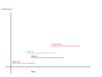
What might be more relevant is a graph that plotted the performance of each model as a line that extends from the month it was introduced to the month it was discontinued.

Just as a vague example, I'm thinking about something like this:

2017-05-16_ModelPerfTimeLineGraph.png

To be honest if you were looking at raw CPU performance on its own, you could probably just make a good old fashioned wacky guess. It's well known that a system like an SE or a Classic performs better than a Plus due to system improvements, but in general, they'll all feel the same relative to, say, an LC or a II, and those will probably feel the same compared to an 840, even though it's often said a II and an LC feel different.

Once you had invented your dataset, you could fill it in later or add test results to take averages from and amend the graph as needed.

This way there's no 3d perspective issues to cause perception problems.


Trash80toHP_Mini

NIGHT STALKER
That's exactly what I illustrated from top and side views in the IP. Lay the everymac timeline down on the table and mirror their parallel production timelines in depth by performance with the axes as you've labeled them.

3D is the only way to do it because of the overlapping time tracks. I really like the notion of stair stepping the performance levels for each model well past the production period under the different OS levels it supported over its useful and then its relatively useless lifetime. Relative production windows as represented in everymac's timeline is a useful, but very limited way to look at models.

Two dimensional data piled in blocks so it "looked like" a 3D representation on the page was Macworld's way of hiding numbers that wouldn't have looked good at all when accurately represented in a simple bar graph. It doesn't pay to honk off your advertisers by being tooooo truthful in your reviews.


Cory5412

Daring Pioneer of the Future
Staff member
Reading the first post again - I guess my question is why does it need to be 3d at all? Unless there were, say, two models with identical performance and identical lifecycles -- but those systems should probably just be represented by a single line anyway, or by adjoined lines if different intro/discontinue dates need to be put in.

Edit: And up through the end of the 68k times, very few models truly had identical performance. Even the 650/800 appear to have been specified with different RAM, so in stock configuration you may have seen different performance in synthetic benchmarks, with the 800 probably just barely edging out the 650, probably by an amount not even worth talking about.

Interesting regarding the "too truthful" comment. Do you have any specific examples? Most of MacWorld 1984-1999 is on archive.org. It would be interesting to see what particular models MacWorld may have been trying to hide bad performance on synthetic benchmarks for.

 
Last edited by a moderator:

Trash80toHP_Mini

NIGHT STALKER
Production period is flat file data on the XY axes in the everymac graph. Adding performance data requires addition of the Z axis. Displaying "identical" performance of overlapping models would be the perfect example for the need for adding the Z axis data for graphing.

The "fake" 3D graphs that can be used in disguising data (not positive about intent, but convenience is undeniable) are on record somewhere, I don't have any examples handy. Now that you've gotten me thinking about it, I'll have to search the tearsheet box for clone era system performance reviews. I'll bet that was where I made the observation, there were a lot of competing paid advertisers to honk off in that time frame. ;)

Such Z simulation of XY data makes for pretty, if not very effective graphics in presentation programs. Makes for a very convenient smoke and mirrors bedazzlement tool.

This project requires actual data to be presented and viewed as in a 3D chess board.

Meanwhile, if anyone has a link to Apple's CEO change dates, I'll gladly add those dividers to the Wikipedia timeline for posting. Was Gassee a CTO? That position's timeline ticks would be interesting as well. Digging through a bunch of bios on Wikipedia (or reliable source info) isn't something that sounds like it would hold my attention for very long. But I'd love to "see" the data and it's easily overlaid on the model timeline. Ganging the baseline graphic vertically for discrete presentation of CEO/CTO overlap would be a slick way to do it.

 
Last edited by a moderator:

Cory5412

Daring Pioneer of the Future
Staff member
How would you use the Z axis? Is Z performance or are you putting models with the same performance next to one-another?

Another possibility is to use pop-out flags to designate a particular model ending or starting within a performance band, although it just seems like it might be better to do the graph we've already described and use flags to indicate the start and end of particular models. This would of course be better in some kind of interactive media, where you can disable/enable certain models, eras, etc so that you can easily see what you want.

Granted, this whole thing is sort of weird because you can still just set a bunch of models next to each other and use graphs to display performance. The only thing we get from putting it on a timeline is to see rising Mac performance over time, and perhaps to see relative to time what the highest and lowest performance levels on sale at a given point of time were. aka how long did the MD101LL/A sell for, how long did the Mac Plus sell for, both far beyond their expiration dates, the lowest performing machines in the product stack for several years.

 
Top