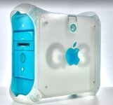
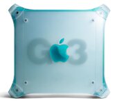
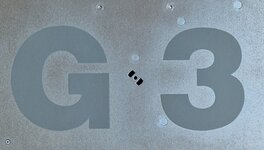
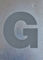
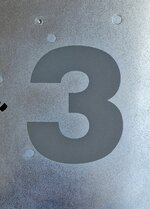
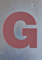
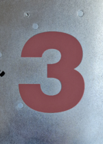
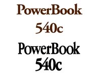
Does anyone know what typeface is used and what size the letters G3 are?
You are using an out of date browser. It may not display this or other websites correctly.
You should upgrade or use an alternative browser.
You should upgrade or use an alternative browser.
Font & Size of the letters G3 on the Blue & White case
- Thread starter ArmorAlley
- Start date
Exactly.
Which is what I did and forgot to measure them.
I'd rather not strip my machine again, if I can help it.
I'm really hoping that this question has been answered before.
By serifless, do you mean sans-serif or a serif'd type with its serifs manually removed in Illustrator?
I'll have a look at the Antiqua type families.
@Danamania Hi Dana, do you have these details offhand? Did you calculate them when you made your G3 Cube?
That is a very good idea.Try running it through the website What The Font.
I tried it just now with the picture MacUp72 supplied above but it is too vague.
I'll go hunting for better pictures after work tonight.
The issue is going to be that you only have two characters - it will struggle to narrow it down.That is a very good idea.
I tried it just now with the picture MacUp72 supplied above but it is too vague.
I'll go hunting for better pictures after work tonight.
There’s a Yahoo Auction for just the metal casing, with this photo:
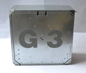
It still looks like a very near match to Helvetica Black to me. Not perfect, but I can’t tell if it’s just the angle of the photo or something more.


It still looks like a very near match to Helvetica Black to me. Not perfect, but I can’t tell if it’s just the angle of the photo or something more.

Your best bet is to find a close enough font, take it into a program like Adobe illustrator, put the scan above into a translucent locked layer, on the main layer type G3, adjust size and letter spacing to match the scan as much as possible, then convert to outlines. You can then tweak the outlines to match the treatment on the case as closely as possible. Delete the scan layer, export as something like SVG, and use that.
It is highly unlikely that this is an unmodified off the shelf font so the likelihood of finding an exact font match is not high. But most of these logo treatments are based on a font and then customized for the particular application and size. I imagine Jobs and Ives arguing two weeks about the shape of the G.
It is highly unlikely that this is an unmodified off the shelf font so the likelihood of finding an exact font match is not high. But most of these logo treatments are based on a font and then customized for the particular application and size. I imagine Jobs and Ives arguing two weeks about the shape of the G.
I imagine Jobs and Ives arguing two weeks about the shape of the G.
Well done everyone and especially @mg.man! This is super.
Woudl you do me the favour of measuring the height of the letters please?
As it happens, the 3 will turned into a 4 and the other side will have a QS.
I have a Blue & Silver G3 and I have the parts for a Black & White G4 with a Quicksilver motherboard that has just come my way.
Wish you'd gotten back sooner... it's back together now.Woudl you do me the favour of measuring the height of the letters please?
Don't worry about it. It won't be hard to get.Wish you'd gotten back sooner... it's back together now.
Is that a G4?I can't help with the type and size, but as it happened I'm replacing a cracked side panel today, so snapped you these :
View attachment 57991
View attachment 57992
View attachment 57993

Apple's corporate font was a variation of Garamond called Apple Garamond for many years. Most of their adverts and case test and manual covers and other stuff were Apple Garamond through the 80s and 90s at least.Helvetica Black is a good match, a bit of twisting and bending and its good..
I noticed that with the earlier PowerBook font, it's basis is a Adobe Garamond Pro bold but it certainly was altered.
View attachment 58005
Apple Garamond is a variant of ITC Garamond, condensed and with a taller x-height (clearly visible in @MacUp72’s image above), and actually predates Adobe Garamond by several years. https://en.wikipedia.org/wiki/Typography_of_Apple_Inc.#Apple_Garamond
At least Wikipedia says Adobe Garamond was released in 1989, and Apple used it going back to (at least) the original Macintosh in 1984. Also I remember from the ‘90s hearing it referenced as a flavor of ITC Garamond, never Adobe Garamond.
At least Wikipedia says Adobe Garamond was released in 1989, and Apple used it going back to (at least) the original Macintosh in 1984. Also I remember from the ‘90s hearing it referenced as a flavor of ITC Garamond, never Adobe Garamond.
Compare it to Triumvirate Heavy from Agfa Type.The 3 looks like a near-perfect match to Helvetica Black, but the G doesn’t quite line up. There are a few adjustments, condensing it slightly and straightening the lower stem of the G.
Similar threads
- Replies
- 4
- Views
- 576


